The brand addition is not tied to the logo. It is placed variably and according to the respective medium. The English brand addition is always used for international media. With one exception: French media. The French brand addition is used here.
The use of the brand addition depends on the respective addressee and the content. If detailed information about the company or about the brand and product is available in the text or can be assumed by the addressee, the addition can be omitted as a design element.
The word mark remains the most important corporate sender.
Distance
The word mark should always be placed with its defined protective space on a quiet surface. The protected area is the height of the word mark - marked "x" in the illustration. There should be no text or graphic elements/images in this area that could affect the presentation of the brand name.
If the logo is placed on an image, it should be placed in a quiet area of the image and in sufficient contrast to the background (in black or white).
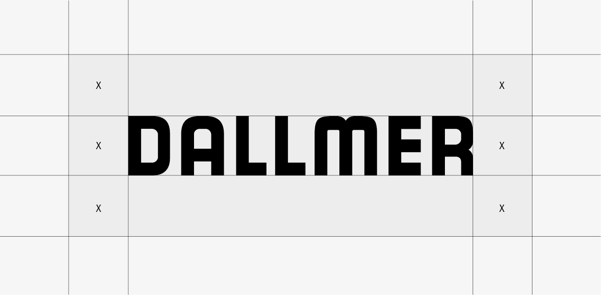
Protective space: x corresponds to the height of the logo (height of the letter "D")
Position
The logo is placed in the corners of a medium. Depending on the layout, it can be placed at the top or bottom edge, in the left or right corner.
The word mark and brand addition can be separated and placed in horizontally opposite corners. In this case, the wordmark is positioned to the left of the brand addition.
The height of the trademark suffix corresponds to the height of the word mark.
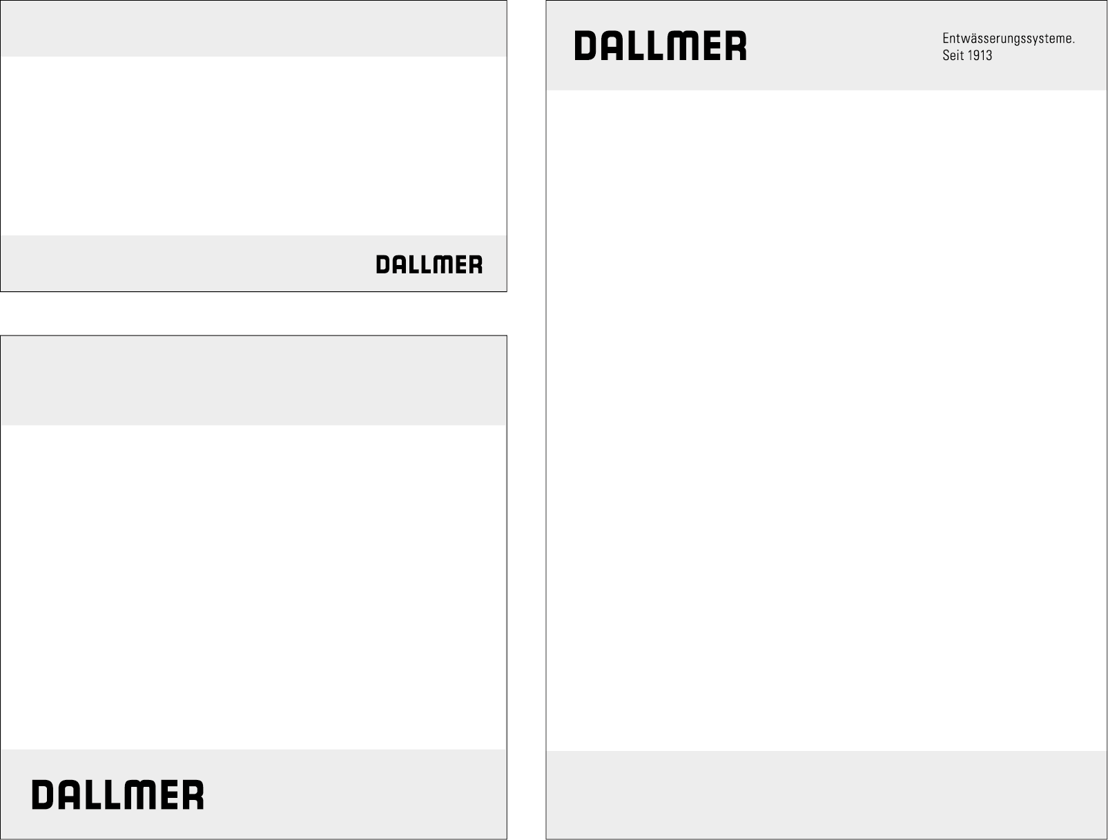
The logo can only be used once per layout
Sizes
The logo size is generally variable. It depends on the respective positioning of the logo and the format of the medium.
The minimum image size of 20 x 3.4 mm applies to print media.
A minimum width of 100 pixels applies to digital media.
Dont's
The Dallmer word mark may never be changed. It may only be used in its entirety.
Any alteration or falsification is prohibited.The use of effects is prohibited.
(see exemplary illustrations).
The consistent and coherent visual representation of the brand is a prerequisite for a uniform image.
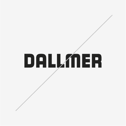
Contour/Outline
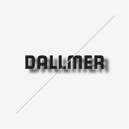
Shading
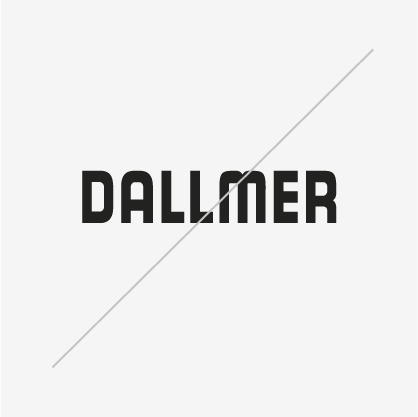
Distortion
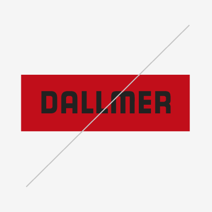
wrong background
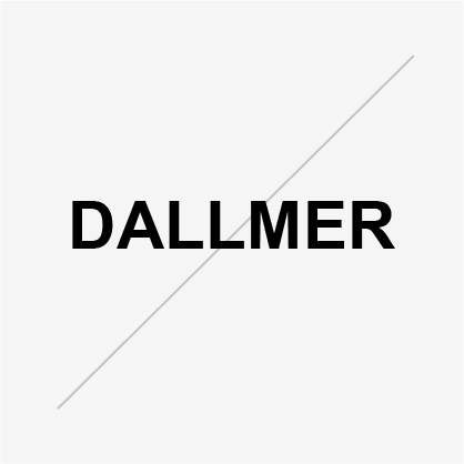
wrong font
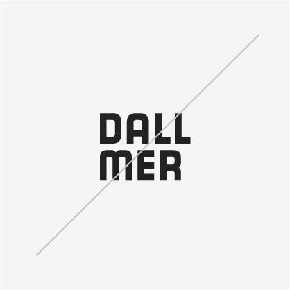
Modification
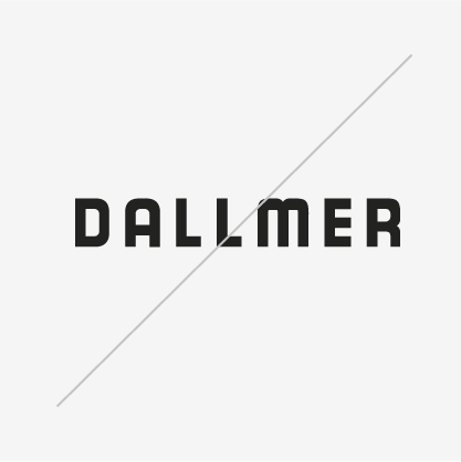
Incorrect running width/spacing
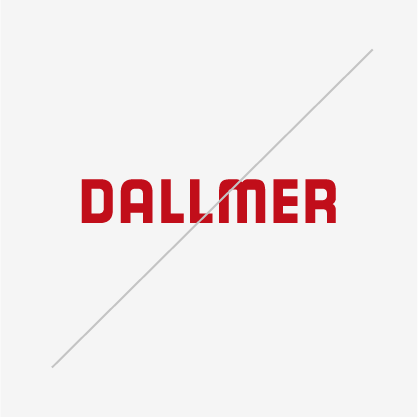
wrong color
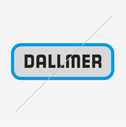
wrong shape
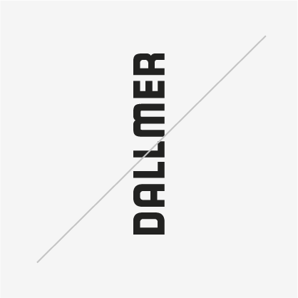
Rotation
Cropped mirroring
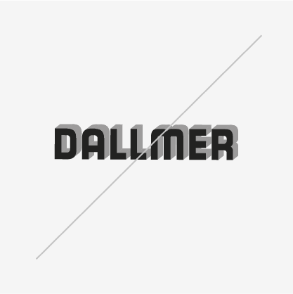
3D effect