Logo
The logo is either black on a light background or white on a dark background. The size of the logo is variable and depends on the respective positioning or format.
Variants
Word mark on white
Word mark on black
Word mark + brand addition on white
Word mark + brand addition on black
Colors
On a visual level, our brand essence is mainly represented by the primary colors white and black as well as the secondary colors cyan and green. The brand-typical weighting of the colors across all media is decisive for the uniform appearance with high recognition.
Primary colors
Black and white, the primary colors of the Dallmer brand, have the largest share across all media. They stand for clarity, precision, efficiency and structure.
black and white
Logo, text, backgrounds, distractors, icons, illustrations, line drawings, architecture/interior design (accessories) furniture, trade fair constructions
Name: white
CMYK 0 / 0 / 0 / 0
RGB 255 / 255 / 255
HEX #FFFFFF
Name: black
CMYK black 0 / 0 / 0 / 100
CMYK deep black 70 / 50 / 50 / 100
RGB 32 / 32 / 30
HEX #20201e
Secondary colors
Cyan stands for water, flexibility and innovation. Cyan is used as a signal color and spot color and communicates all direct themes of the Dallmer brand. The 100 percent cyan offers a high color contrast to the primary colors black and white, sets accents, increases user-friendliness and is ideal for the design of disruptive or digital elements. The Dallmer cyan also offers a good long-distance effect.
Green stands for partnership and trust and visualizes Dallmer's service-oriented, human approach. Green is used as an accent color for messages and media that need a personal, warmer touch.
cyan
Distractors, buttons, active elements, backgrounds, topics directly related to the Dallmer brand (job advertisements, technical information ...)
Name: cyan
CMYK 100 / 0 / 0 / 0
RGB 0 / 157 / 224
Hex #009de0
Pantone Process Cyan C
green
Visual language, backgrounds, topics with a service character (services, partner offers, seminar communication ...)
Name: green
CMYK 70 / 30 / 75 / 40
RGB 79 / 115 / 82
Hex #4F7352
Tertiary colors
The tertiary colors are black and dark green. They recede visually and are used for neutral purposes, for example as a background (info boxes, bundling of information, structuring of pages and sections, social media and web media).
black and dark green, rasterized
Backgrounds, text fields, info boxes, postings
Name: black 20%
CMYK 0 / 0 / 0 / 20
RGB 217 / 217 / 217
Hex #d9d9d9
Name: green 20%
CMYK 14 / 06 / 15 / 08
RGB 213 / 218 / 209
Hex #d5dad1
Name: black 10%
CMYK 0 / 0 / 0 / 10
RGB 236 / 236 / 236
Hex #ececec
Name: green 10%
CMYK 7 / 03 / 08 / 04
RGB 234 / 236 / 231
Hex #eaece7
Typography
Typography plays a decisive role in the staging of the Dallmer brand. It significantly conveys personality, values and identity. The selected fonts and the respective font styles shape the visual perception and enable consistent and appealing communication.
House font
Univers is the corporate typeface of the Dallmer brand. It is used for all texts - from correspondence to communication - and emphasizes technical content particularly well with its sober, factual and modern character.
The 47 Light Condensed cut used has an ideal running width for volume texts and has a timeless and stylish appearance. Characteristics that match the Dallmer brand's self-image: efficient engineering with design standards and a focus on service.
Subscription
If you have any questions about subscribing to the publications, please contact:
Our in-house font Univers is a licensed font that is pre-installed on every company computer. For documents that are also used on external computers - such as presentations - Arial should be used.
A B C D E F G H I J K L M N O P Q R S T U V W X Y Z
a b c d e f g h i j k l m n o p q r s t u v w x y z
0 1 2 3 4 5 6 7 8 9 /: + ! ? = * % &
All Dallmer products are still developed, designed and manufactured using state-of-the-art technology at our production site in Arnsberg.
Univers Std 47 light condensed
Decorative font
Corporate A is used as a decorative font. It sets accents in headlines and highlights messages with a service character. Corporate A conveys a classic elegance and contrasts well with the corporate typeface. A harmonious interplay.
The selected font style light italic is recommended for use in headlines and texts with larger point sizes. Here, the italic, "running" style conveys flexibility, approachability and dialog orientation. Ideal characteristics that emphasize service topics and strengthen customer loyalty in a spirit of partnership.
Subscription
If you have any questions about subscribing to the publications, please contact:
Our Corporate A decorative font is included in the Adobe package royalty-free in various weights.
A B C D E F G H I J K L M
N O P Q R S T U V W X Y Z
a b c d e f g h i j k l m n o p q r s t u v w x y z
0 1 2 3 4 5 6 7 8 9 /: + ! ? = * % &
Welcome to the world of Dallmer. As a strong service partner, we would like to provide you with comprehensive support: with innovations, knowledge and personal service.
Corporate A light italic
Design language
The Dallmer design language includes symbols, icons and pictograms. These offer many possibilities to support and facilitate the communication of content.
As visual anchors, they increase the memorability of content. As powerful tools, they strengthen identity, arouse emotions and promote recognizability.
All symbols, pictograms and icons are unmistakable. Their design language is derived from the Dallmer logo and the Dallmer DNA. The typical interplay of round, angular and linear elements visualizes the personality of the brand.
It is important to design these elements carefully and use them in line with the values and objectives of the Dallmer brand.


Design language

Symbols

Pictograms

Icons
Symbole
The Dallmer symbols are composed of concise forms of the word mark and simplified forms of technically constructed molded parts of the Dallmer product world.
The symbols have different meanings and are used to represent ideas or concepts or to summarize sections of meaning. They are abstract elements with a decorative character rather than symbols with a clear message. In the layout, they direct the eye and differentiate content.
Our symbols are always used in the primary colors white or black. They are used sparingly and carefully. This allows their visual power to unfold.


Pictograms
The Dallmer pictograms are made up of scaled-down forms of the symbols. Their finer grid makes it possible to work more iconically and pictorially. This creates characters or figures.
In this way, the design language fulfills a dual function: it enlivens classic print communication and creates a dialog orientation in terms of design. At the same time, it can also become an interactive component of software applications, websites and mobile implementations.
Pictograms guide users visually. They make navigation easier, increase attention and motivate interaction. Pictograms help to establish the visual language of the Dallmer brand consistently and across all media in documents, applications or on a website.
Product information
Arrow
Cleaning
Assortment list
Price list
Assembly instructions
Highlight
Focus

Product change
Zero
One
Two
Three
Icons
The Dallmer icons are pictorial calls to action or instructions. They are a stylized representation of objects, situations or actions. They help to bundle information and present it simply. They convey their message at a glance and in an internationally understandable way.
Important: New icons are based on existing icons. They should be developed according to the already defined proportionality and line width. This ensures a uniform appearance.
Best Practices
The following examples illustrate the effective use of the Dallmer design language in practical applications.
Visual language
In our family business, we combine the art of engineering with innovative strength and service orientation. We develop well thought-out solutions from the user's point of view. Our high material, safety and design standards should also be conveyed intuitively through our visual language.
Different image levels and image categories help to structure and communicate content thematically. The overall result is a uniform and consistent look with stylistic elements typical of the brand.
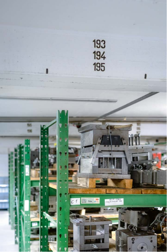
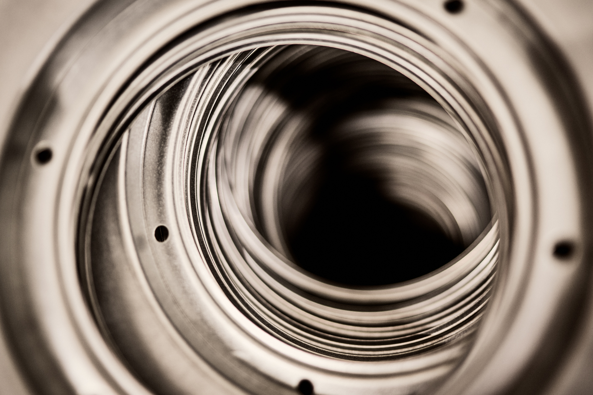
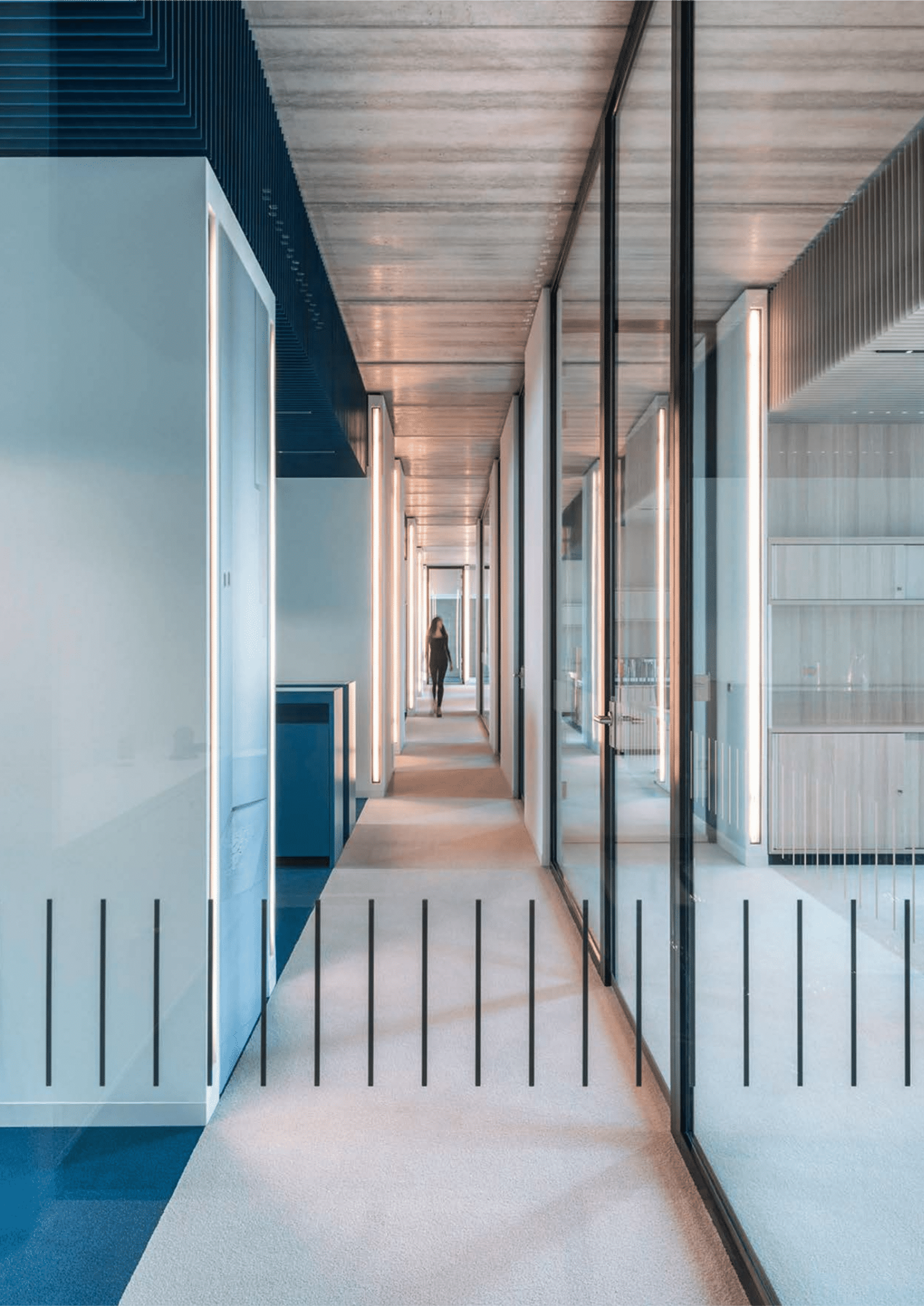
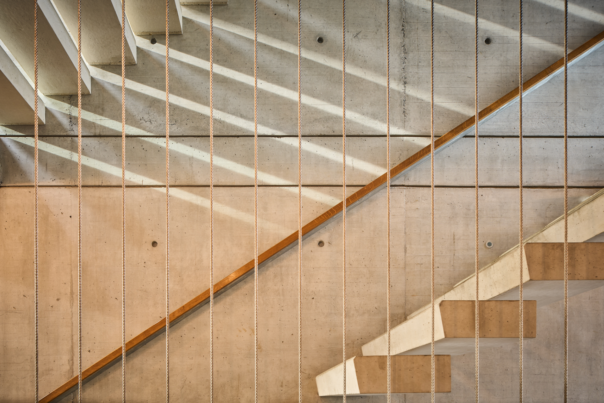
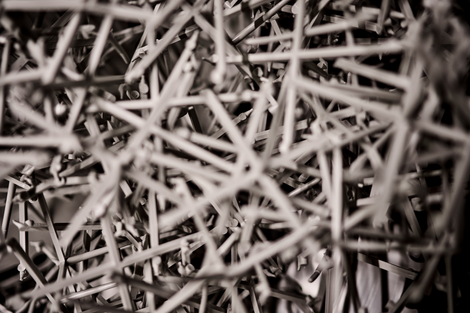
Image level
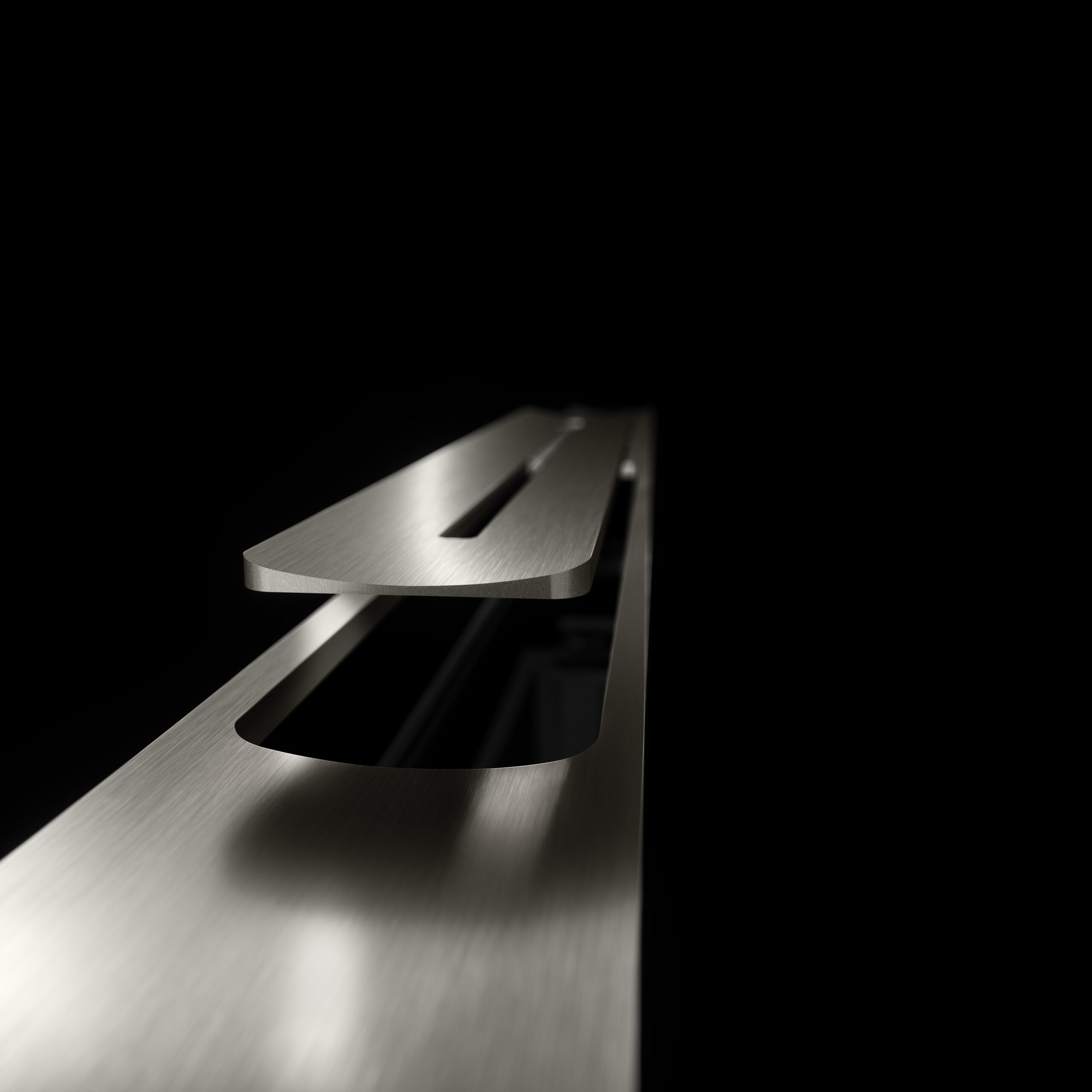
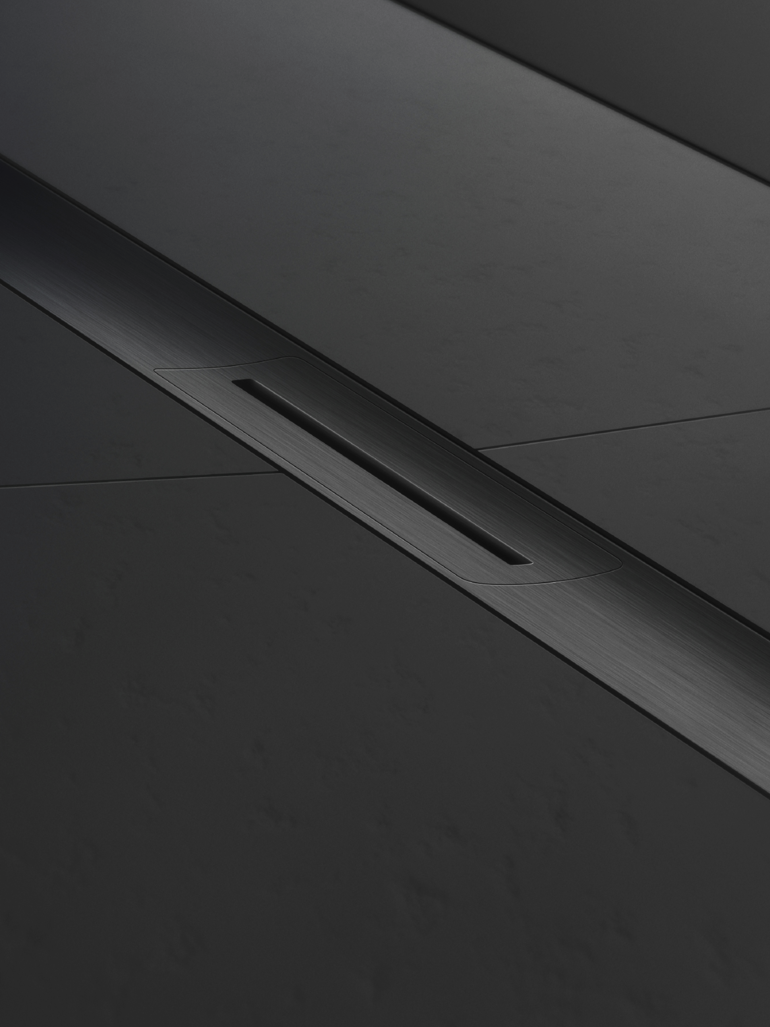
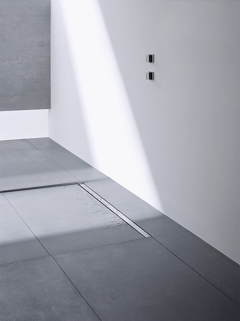
The image level forms the overarching level of the Dallmer visual language. It comprises images that visually characterize the Dallmer brand independently of specific product campaigns or launches.
The image pictures primarily follow an aesthetic concept that reflects the brand's design aspirations. Product images are also kept abstract and fulfill formal requirements instead of illustrating functions.
Image look Image level:
Artificial and abstract formal aesthetics.
Stylistic devices are close-ups, blurring, monochrome color schemes in the primary colors black and white. In addition to products, calm, monochrome water surfaces can be used for collages and backgrounds.
Please contact us for our licensed additional motifs:
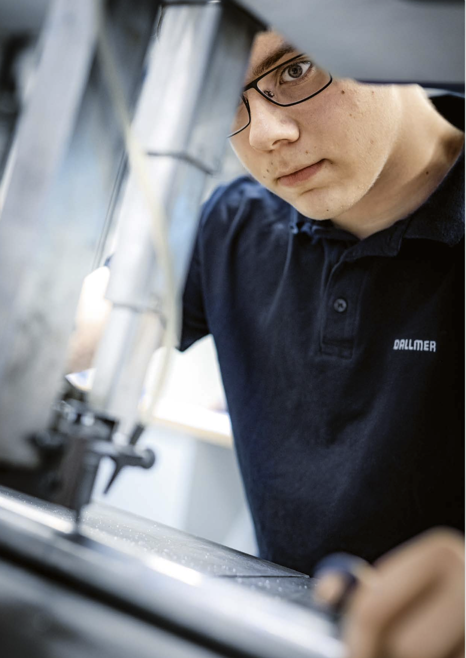
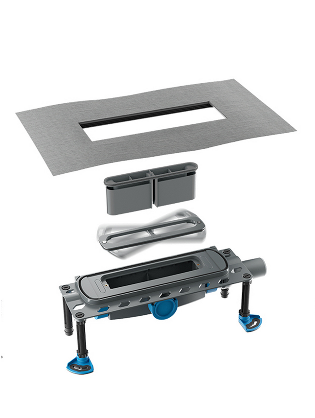
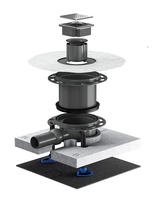
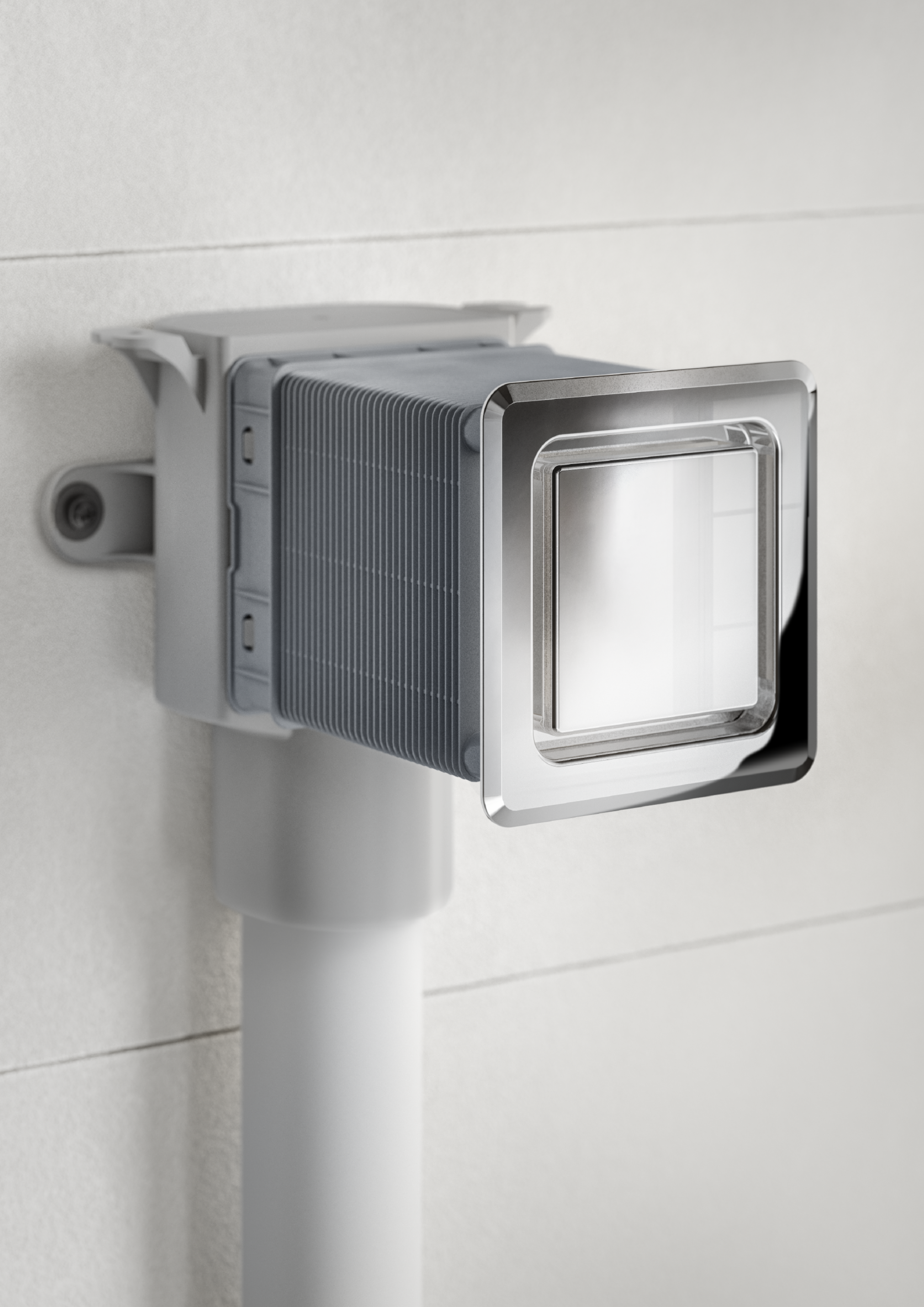
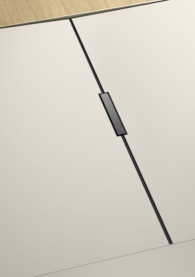
Product level
At the product level, the aesthetics that images follow in the product-related environment are defined. The focus is always on the product. The perfection of the product must be recognizable down to the last detail. This results in a less abstract, more concrete illustration of Dallmer products.
Typical for the product images are: Close-ups, milieu motifs and cut-outs
Product level image look:
Stylish product images as cut-outs, close-ups and milieu motifs. The product and its function are recognizable. Properties and components are depicted true to the material and objectively.
Tender text
Data sheet
BIM
Configurator
DXF
Assembly instructions
System cuts
Magnetic
no pin
do not label
Desinfection
Ladies
Men
barrier-free
Transponder
Darkroom
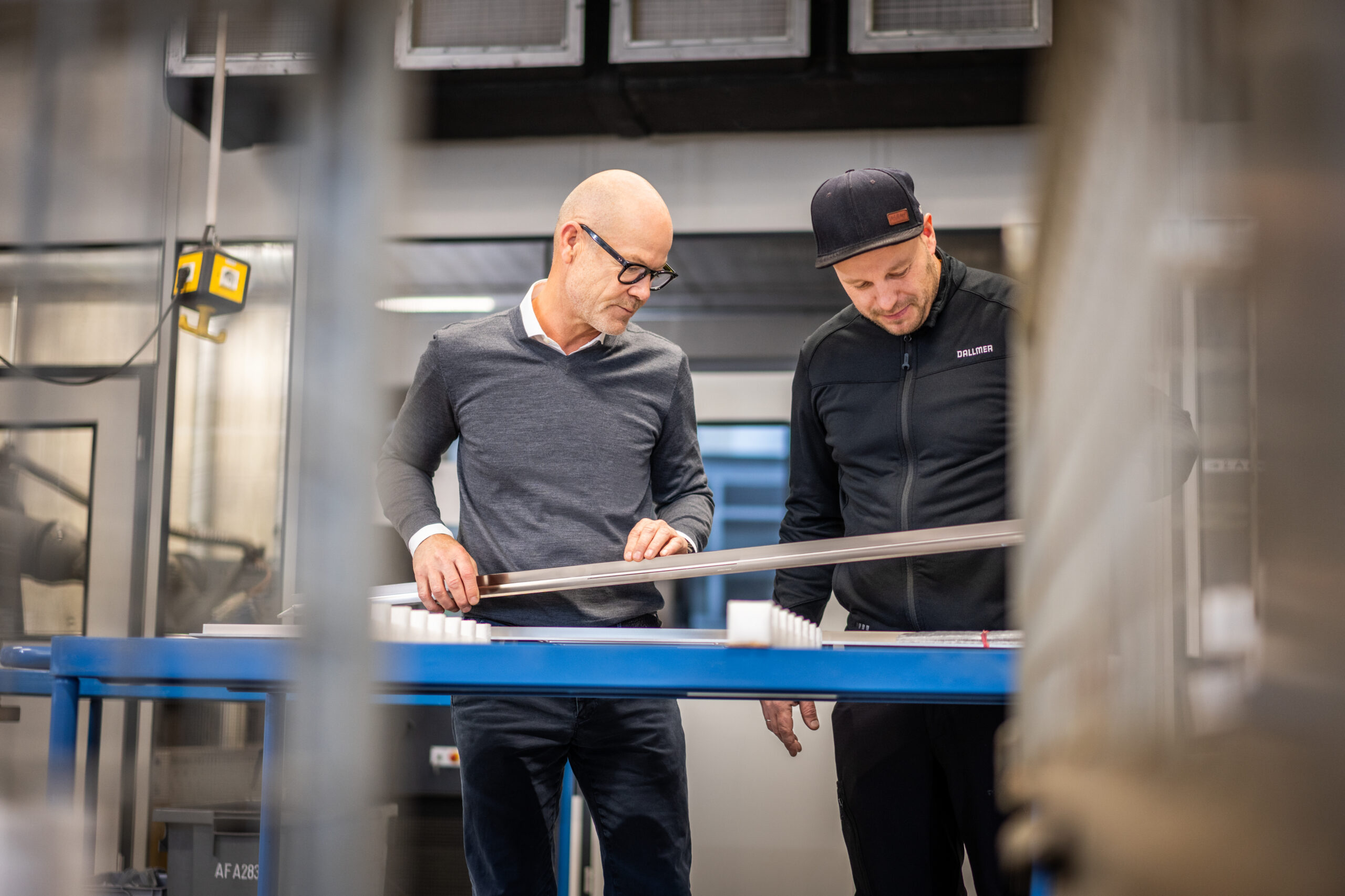
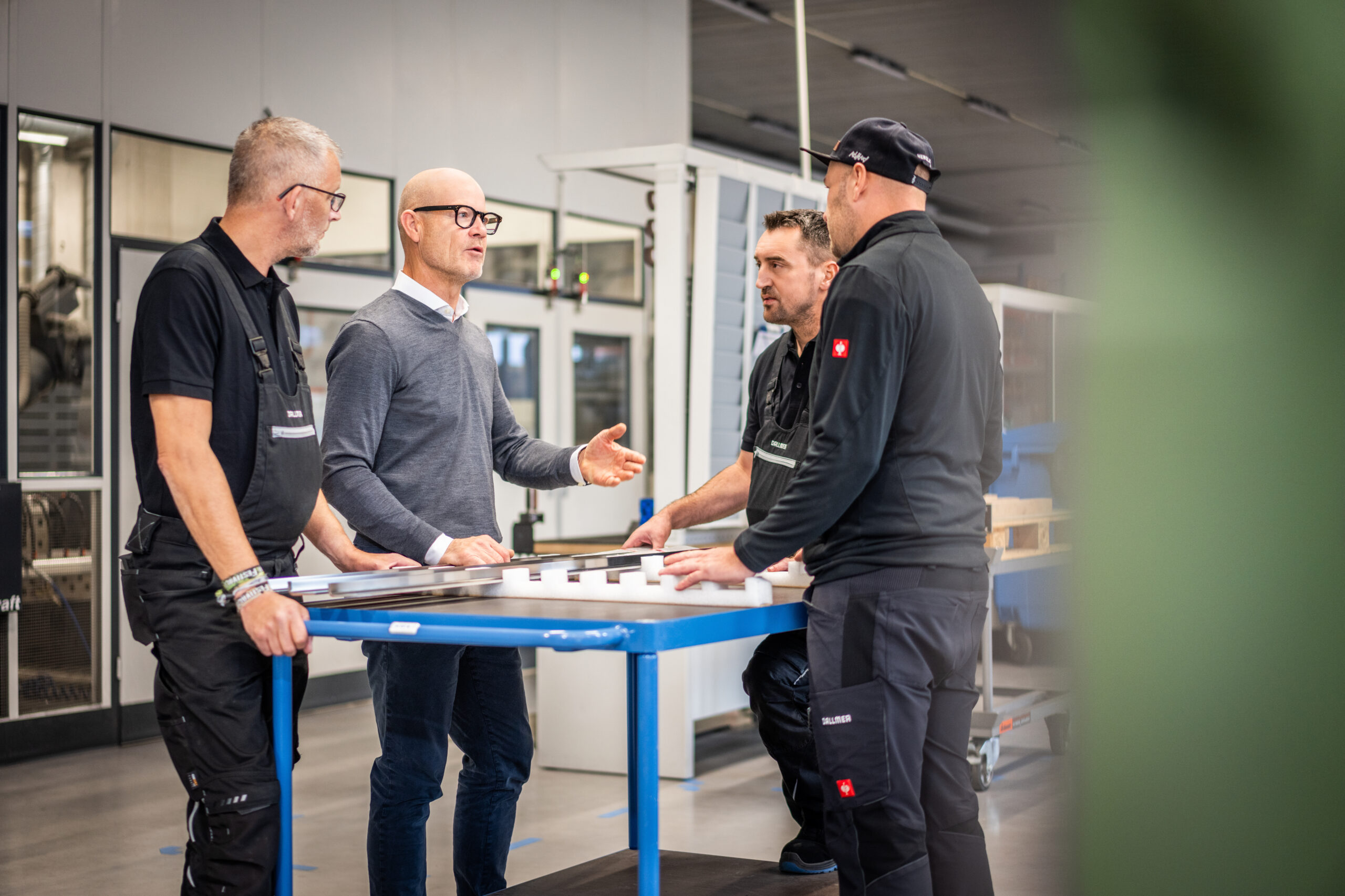
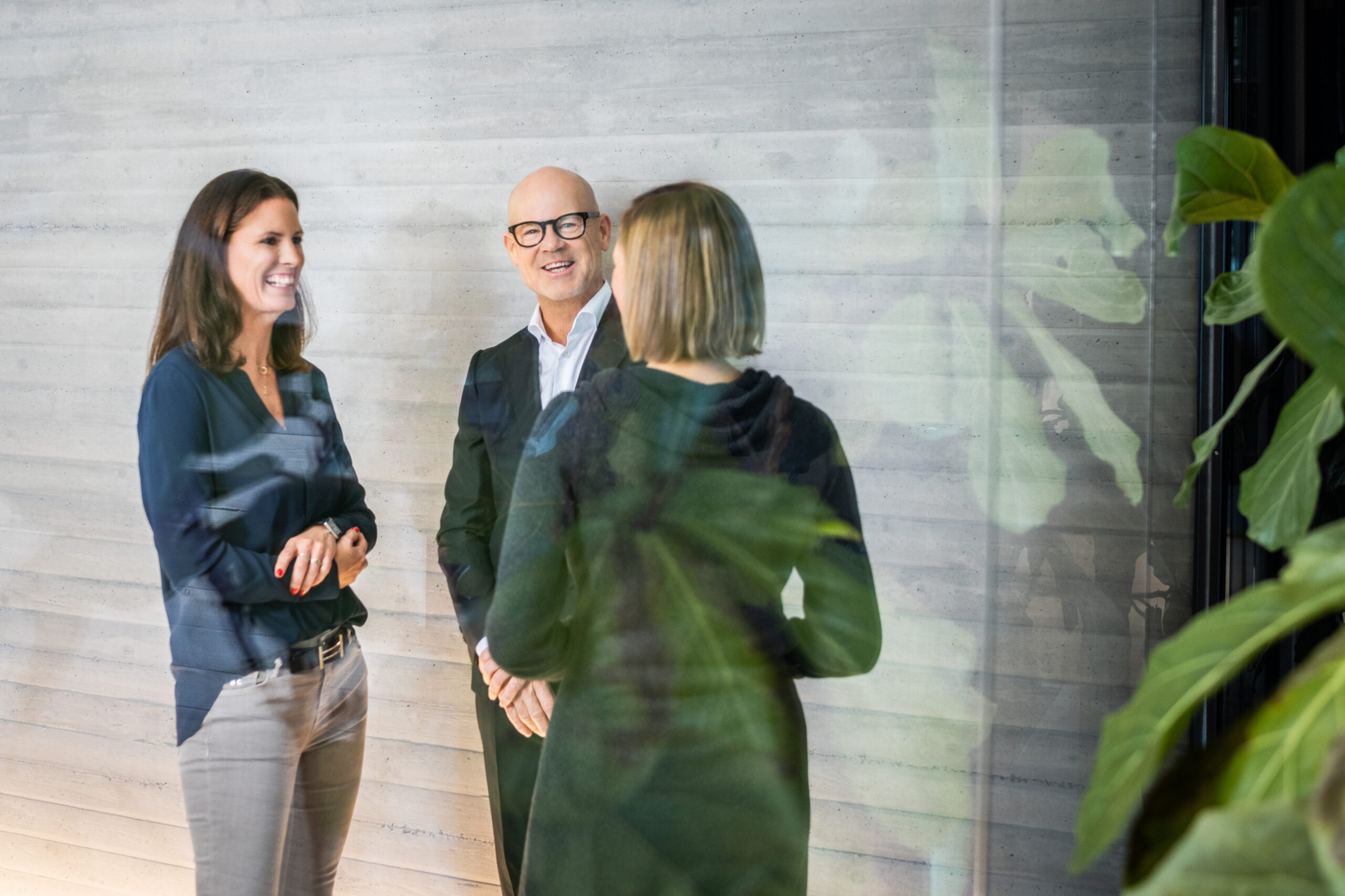
Reportage level
The reportage level creates closeness and provides human insights into the company. This level depicts the Dallmer family business, the employees, production and the company headquarters.
As a future-oriented company with a long tradition, Dallmer opens up to the outside world and becomes approachable. A lively documentation in the form of insights into the day-to-day work of various departments as well as portraits of employees and the management. Teamwork, collegiality, professionalism and experience become tangible. Our company gets a face and is a partner at eye level.
Image look Reportage level:
Open, approachable and unaffected. This is how commitment and enthusiasm for companies and products are expressed. Always professionally and aesthetically staged. Trade fair appearances, seminars or other company-related events can also be accompanied photographically.